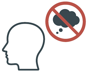
Krug's First Law of Usability
Don't make users think; simplicity rules.
"Don't make me think." 1

When users encounter a digital product, they rarely read every word or carefully evaluate every option. Instead, they scan for what stands out, act on the most promising cue, and move quickly. This behavior, rooted in our cognitive need to conserve effort and reduce friction, is what Steve Krug highlights in his first law of usability. For Agile teams, which prioritize iterative delivery and validated learning, this insight has profound implications. If the product demands too much thinking or exploration, it slows user feedback, erodes satisfaction, and obscures true value. Agile frameworks rely on frequent inspection and adaptation, but that cycle falters when users struggle just to find their way through the interface.
Impact of Poor Usability
Poor usability disrupts the feedback loop essential to Agile delivery. When users stumble or hesitate, teams receive distorted signals about product value, leading to wasted effort and slower iterations.
- Delayed Feedback and Reduced Learning:
- Users abandon features or workflows that are confusing.
- Teams misinterpret low engagement as low demand, not poor usability.
- Misaligned Metrics:
- Drop-off rates may appear to signal lack of interest.
- Click patterns skewed by unclear options make A/B testing less meaningful.
- Increased Support and Rework:
- Support tickets surge for features that "should have been obvious".
- Teams must revisit UX and design decisions late in the development cycle.
- Fractured Collaboration:
- Product and engineering debate intent versus implementation.
- Stakeholders lose trust when shipped features confuse rather than convert.
Scenario
An Agile product team working on a new internal dashboard for sales operations releases an MVP with robust functionality, but minimal user interface refinement. Early adopters complain that key actions like generating reports are "buried" or "hard to find". Despite Daily Scrums and regular Sprint Reviews, the team keeps optimizing backend performance, believing users just need more training.
- Confusion around button labels like "Retrieve" instead of "Download Report".
- Navigation relies on hidden menus rather than visible cues.
- Data input forms have unclear placeholder text and no inline help.
After two Sprints of user complaints and dwindling usage, the team realizes that usability, not functionality, is the blocker. Valuable work has gone unnoticed simply because users couldn't find or understand it.
Ways to Mitigate Poor Usability:
To make user paths obvious and intuitive, Agile teams should proactively incorporate usability into their Definition of Done and Sprint Planning discussions.
- Build for Scanning, Not Reading:
- Use visual hierarchy to guide the eye.
- Make clickable elements visually distinct.
- Iterate with Real User Input:
- Include usability tests during each Sprint.
- Run task-based evaluations with representative users.
- Integrate UX Early and Often:
- Involve designers in Backlog Refinement.
- Define usability goals for each epic or story.
- Adopt Lightweight Heuristics:
- Use "don't make me think" as a filter for all UI choices.
- Prefer familiar patterns over clever designs.
Conclusion:
Agile success hinges on learning fast and adjusting quickly. But when products confuse or exhaust users, that cycle collapses. Krug's usability principle reminds us that value is not just in what we build, but in how easily people can use it. Teams that treat usability as a core functional requirement, not just a polish layer, avoid costly rework, build trust with users, and shorten the path from idea to impact.
- Usability directly affects how quickly feedback loops close.
- Design clarity is a shared responsibility, not just a designer's job.
- Confused users won't wait for your next iteration to get it right.
Key Takeaways
- Users scan; they don't read. Design should guide them intuitively.
- Poor usability slows feedback and distorts product signals.
- Agile teams must prioritize usability in every Sprint.
- Involving users early prevents expensive rework.
- "Don't make me think" is more than a slogan - it's a design imperative.
Summary
Krug's First Law of Usability challenges Agile teams to think differently about how users experience their products. In the rush to deliver value quickly, it's easy to overlook how friction-filled design hinders adoption and feedback. By designing for clarity, testing usability in real time, and making intuitive experience a first-class goal, Agile organizations ensure that what they build is not just functional, but actually usable. This leads to smarter iterations, better metrics, and more meaningful customer impact.